What's a logo? The seven types of logos and which should you choose
You’ve started a business, or want to get into graphic design and branding… the first thing you do is make a logo right? But did you know there were many types of logos, at least seven to be exact!
Let’s ignore the fact that your brand is way more than just a logo and focus on that tiny thing that inspires your business. If there’s seven types of logos how do you know which is right for you?
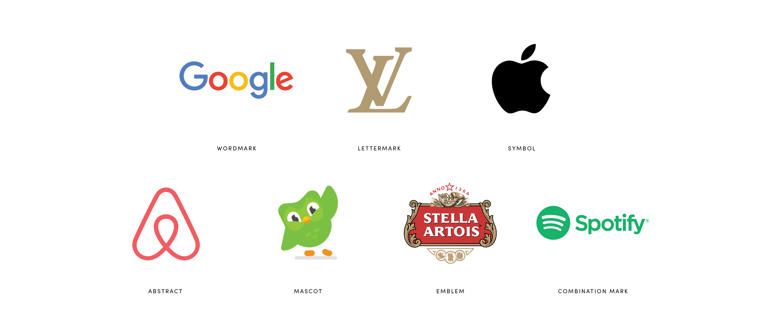
Wordmark
A wordmark logo (sometimes called a logotype) is just text. It’s the company’s name in a nice and usually custom typeface or lettering with no other imagery or symbols. It’s more effective for shorter named businesses and helps to get your business name out there fast. Think Google and Coca Cola.
Lettermark
Similar to a wordmark, a lettermark (or monogram) is just text but instead of using the full business name they use the initials. Anywhere from one to four letters combined in a way that’s eyecatching and unique. If your business name is too long for a wordmark then a lettermark may be an option but you may have less name recognition if the audience doesn’t understand what the initials stand for. Think about the LV of Louis Vuitton or the P of Pinterest.
Symbol
A symbol (or brandmark) is a graphic icon that represents the brand’s identity. Bold, simple, and eyecatching shapes that symbolise the business. Often brands transition to this type of logo after they’re well established. New brands may have to use a wordmark alongside a symbol for name recognition until your audience is acquainted with your business. Think Apple or the Snapchat ghost.
Abstract
Similar to a symbol, abstract logos are made up of a graphic icon that represents the brand’s values or concept. They’re more abstract than a symbol and allow you to create often a very unique mark to represent your business. Think AirBnB or the Nike swoosh.
Mascot
Often used for sports teams or food brands, mascot logos are a graphic character illustration depicting a person, animal, or human like form. These logos create a friendly ambassador for your brand that can connect with your audience. Not really suitable for a serious business but are great for businesses targeting families or children. Think KFC’s Colonel or Duolingo’s Owl.
Emblem
A pretty common old school logo, the emblem is reminiscent of a crest. They combine text and symbols inside a container of sorts; like a seal, stamp, or crest. Usually unique enough that you’ll stand out from a crowd although they’re not super scalable (not favicon friendly). Think about football team crests like Manchester United, beer logos like Stella Artois.
Combination Mark
Similar to an emblem, a combination mark does what it says on the tin. It combines text and symbols together, either in a mark together or separately side by side. Combine your wordmark and symbol side by side to create a highly recognisable logo to boost that brand recognition. This type of logo also gives you the option to use the symbol or wordmark on their own when you need it, it’s adaptable to use across all mediums. Think Burger King or Spotify.
So now you know about the seven options, how do you choose? It all comes down to your business and what suits your brand and values more.


