3 ways to add detail and dimension to your lettering

Adding details and dimension to hand lettering can take a piece from okay to amazing, you just need to think about what details you're adding. Three ways of adding detail and dimension is adding shadow, shading, and inlines. Learning the difference between the three, and their sub-details can help you level up your lettering!
So let's talk about adding shadows
A shadow in nature's sense is when a dark area is produced by a shape blocking the rays of light between the light source and a surface. So in lettering or design this is most commonly thought of as a drop shadow. If you've opened Photoshop or a similar program at least once I'm sure you've played with the drop shadow effect. The same applies to your analogue or digital lettering.
A drop shadow would naturally fall on the opposite side of the light source, so if you're just starting out sometimes it's simpler to sketch in a light source to follow so you know exactly where the shadow will fall.

Similar to playing around with the effect in Photoshop the distance, size and opacity will effect what your shadow looks like. If you want a soft drop shadow behind your lettering, like example 3 above, lower the opacity and have a looser less defined edge to your shadow.
Adding a shadow to your digital art in Procreate is easier than you may think. Simply duplicating your lettering layer and adding an Alpha Lock to the new layer underneath allows you to change it's colour to be a more suitable shadow colour and move it wherever is opposite your light source.
If you're wanting a softer more subtle shadow like I mentioned above, simply turn off Alpha Lock and play with the Gaussian Blur tool in the Adjustments drop down. The more blur you add to the layer the more subtle the shadow will be.
Play around with the colour, distance and opacity of the shadow and see what works for the piece.
Let's talk about shades
Shades are different to shadows. A lot of the time I’m adding in a shade while my brain is saying ‘oh yes this is a lovely shadow’. Shades are closed in shadows, they don’t usually have blur added and are usually blocky and bold.
To add in a shade we start out the same as a shadow, considering where the light will fall. If you have multiple words in your lettering piece, and each word has a different shade or shadow applied, most of the time you’ll want to make sure they have the same light source so things don’t look off.

Once we have our light source again same as we did for the shadow, duplicate our layer and once alpha locked change the colour. To change it from a shadow to a shade we have to close in the shape, so turn off alpha lock on your black shape and with the same brush you made the letter with just connect the two A’s like in example 3 above. Simple! Now you have a 3D letter.
Shadows and shades not enough? Add more fun with inlines
Adding inlines is super fun and they’re an easy way to level up your lettering. There’s so many ways you can add inlines to your words, try lines or dots or textures.

Inlines are usually created with a colour lighter than the base colour, sometimes even as light as white if you’re feeling dramatic! Be sure to follow the shape and contour of your letter and if you have a script design you may want to think about where the strokes overlap and remove parts of the inline to add even more depth.
Be experimental and have fun with these three ways of adding detail and dimension to your lettering. Feel free to try and combining some of these techniques, a dark shade with a light blurry shadow beneath can add even more depth than either on their own. Try them out and get your pieces looking fab!
- Sophie
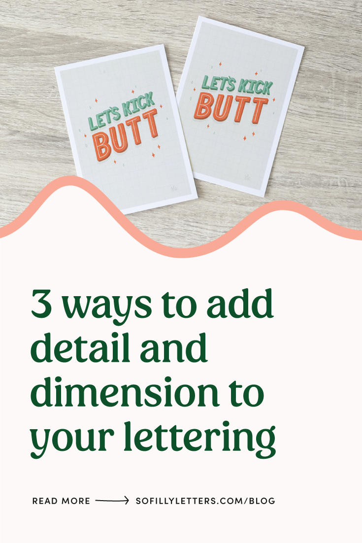
Pin for later!
If you found this useful be sure to share it to Pinterest to come back later, and so others can find it too! Use the Pinterest save button by hovering over the image below.