Winsor and Newton watercolour swatches

I bought my first Winsor and Newton palette back in 2013, it was a big deal to drop that much money as a poor student on art supplies that I didn’t need for University.
I’d only ever watercoloured before using cheap watercolour pencils from WHSmiths that I got when I was around 10. So dropping around $80 on a 12 half pan set was a big deal and luckily I really enjoyed them.
I expanded my set by one half pan, Ivory Black, while still in University but the rest were added in during the last year or so. I’ve moved out of the 12 half pan palette into a metal palette that’s meant to hold around 26 half pans. I currently have 25 half pans, the 22 below plus two whites and a blue I mistakenly didn’t swatch - sorry.
Yellows, Oranges, and Reds
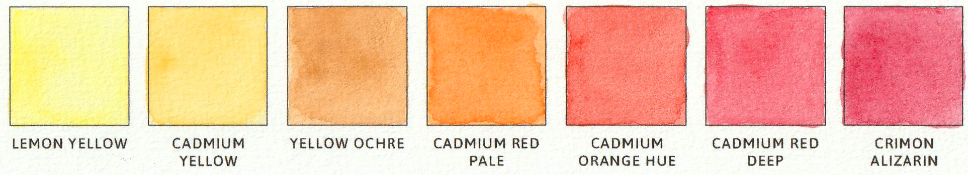
Five of these came with the initial set, and the other two I’ve added pretty recently. Cadmium Yellow is the perfect yellow, it’s rich and warm and just perfect for mixing as well. Cadmium Red Pale hue is my most recent addition to the palette and I think is one of my favourite colours at the moment. Definitely having an orange phase!
Of course you can always mix orange with the yellows and reds but I like having the selection, plus you can always add a bit of yellow or red to skew the orange to the tone you’re after.
Pinks and Purples

Yes I could just add water to a red, or add in some white, but having a pink on hand in a pan just makes things so much simpler. Usually I’d add in a little red or purple to richen the Rose Permanent but doing that each time instead of trying to perfect a perfect pink from red is worth the extra pan, trust me.
Sigh look at those purples, the wee warm Mauve and the cooler Dioxazine Violet, they’re so lovely. Similar to the oranges and the pinks, I can easily mix some purples but having them on hand and being able to just mix a slight bit of blue or red to change them is so handy.
Blues and Greens
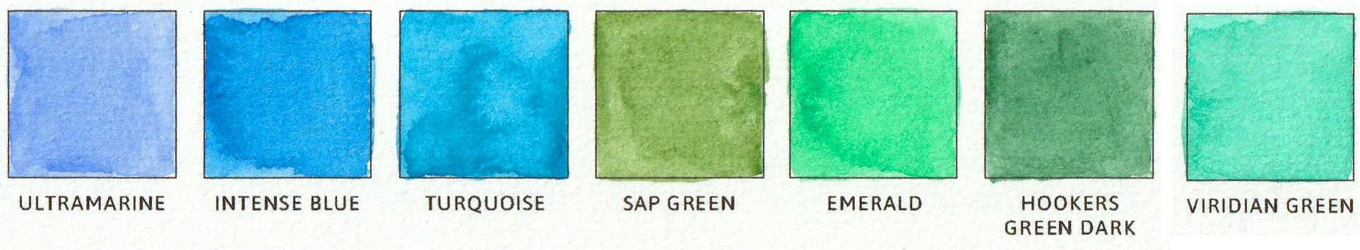
Greens and blues are my favourite. I can’t even believe I somehow forgot to swatch one of my blues, for the record it’s a __ blue and is quite lovely but maybe my least favourite blue of the selection I own. Intense Blue and Turquoise look very similar in the swatches but in real life Intense Blue is much brighter and more blue, whereas Turquoise is a bit darker with a hint of green.
Now I did say the Cadmium Red Pale hue was one of my favourites at the moment, the other is Sap Green. Sap Green has probably been my favourite for a year or so, it’s just lovely. Hookers Green Dark is a close second but man Sap Green is just perfectly mossy and makes any greenery that little bit more realistic.
Browns and Blacks

Not my most used colours but it’s useful to have a selection of browns and greys in a mixture of warm and cool tones. Adding them to other colours to deepen and darken the shades. I find myself reaching for the Sepia and Paynes Grey shades more than the others to darken the other colours as they don’t darken them too intensely and it’s easier to control.
If you want to see what else I use for watercolour I’ve shared a whole post about all the other brushes and tools I use on a regular basis.
- Sophie
Pin for later!
If you found this useful be sure to share it to Pinterest to come back later, and so others can find it too! Use the Pinterest save button by hovering over the image below.